Applies To: WatchGuard Advanced Reporting Tool and Data Control
The Advanced Visualization Tool is an operational and analytical platform that supports WatchGuard Advanced Reporting Tool and WatchGuard Data Control with data generated from Endpoint Security Elite, Endpoint Security 360 and EDR.
Your operator role determines what you can see and do in WatchGuard Cloud. Your role must have the Access File Access Information permission to view or configure this feature. For more information, go to Manage WatchGuard Cloud Operators and Roles.
To open the Advanced Visualization Tool:
- In WatchGuard Cloud, select Monitor > Endpoint Security.
- Click Status > Advanced Visualization.
The left pane of the window expands to show the different functional areas of the Advanced Visualization Tool. Select an icon to view the corresponding page.
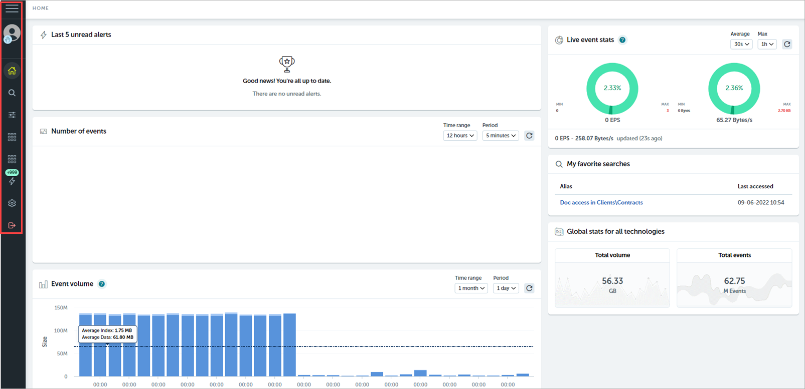
 Home
Home
From the left pane, select ![]() . The Home page provides a quick, real-time overview of event activity, alerts, and statistics.
. The Home page provides a quick, real-time overview of event activity, alerts, and statistics.

Last 5 Unread Alerts
This tile shows the last 5 triggered alerts in your domain. To show details of an alert, point to an alert and select View Alerts Details. To mark the alert as closed and delete it from this list, click ![]() .
.
Number of Events
This tile shows the total number of events received every hour, minute, and so on, over the period of time selected from the Time Range drop-down menu. Click ![]() to update the tile each time you modify the settings. Point to a line to see the specific event count and date.
to update the tile each time you modify the settings. Point to a line to see the specific event count and date.
Drag the mouse on the chart to zoom to the selected area. To return to the default view, click Reset Zoom.
Event Volume
This tile shows the total size of the events received over time with the size of the associated indexed data. ART aggregates indexed data every 24 hours. When you set the Period to a unit of less than 1 day, ART does not plot the indexed data.
By default, the tile shows the volume ingested each day over the last 30 days. Use the Time Range and Period menus to select a different time period and granularity. Click ![]() to update the tile.
to update the tile.
To zoom in, click and drag an area of the chart. To go back to the previous view, click Reset Zoom.
To display a tooltip that summarizes information about that time period, point to a column.
To show or hide a data type, click Index or Data below the chart. Both data types show by default.
Events by Technology
This tile shows the number and size of events received for every type and technology. Use the Time Range and Value fields to select the period you want to analyze and the values you want to see. To update the tile each time you modify the settings, click ![]() . You can also search and filter the tile to narrow down the information shown.
. You can also search and filter the tile to narrow down the information shown.
Drag and drop the grouping keys to change the cell distribution, and point to each cell to see the amount and size of events and their percentage.
Total Daily Volume
This tile shows a heat map calendar that represents the daily volume of data ingested and added to indexes in your domain over the last 12 months.
To display a tooltip of the total volume ingested that day, point to a column. The color scale is dynamic and uses the lowest and highest sizes in the year as reference values.
Live Event Stats
This tile shows meters that indicate the current average levels of ingestion in terms of events per second and data volume per second. The gauges are color-coded with green, yellow, and red to indicate how current ingestion levels compare to the maximum levels over a recent period. The percentages inside each gauge indicate where the current average value compares to the recent minimum and maximum values.
For example, 90% indicates that the current level is close to the recent maximum, 10% indicates a current level closer to the recent minimum, and 50% indicates that the current value is between the minimum and maximum values.
Use the time period selectors to modify the periods compared, then click ![]() to apply your changes.
to apply your changes.
My Favorite Searches
This tile shows a list of your 10 favorite queries. If you marked more than 10 queries, you only see the last 10 favorites.
Global Stats for All Technologies
This tile shows the total volume and count of events received in all your domain tables. You can select Voronoi cells in the Events by Technology tile to see only the technology you want to evaluate.
 Data Search
From the left pane, select ![]() . On the Data Search page you can explore the accumulated data and browse or open search queries.
. On the Data Search page you can explore the accumulated data and browse or open search queries.
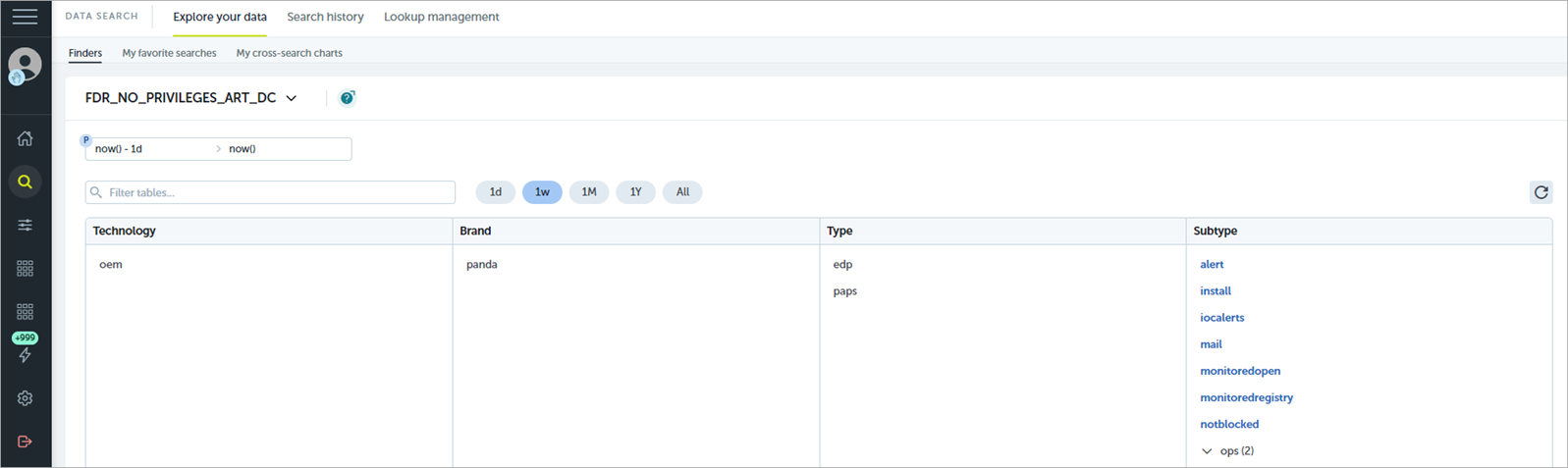
Explore Your Data
On the Explore Your Data tab, you can run a search. Select the tags that correspond to the table you want to search. For more information, go to About Data Tables.
Search History
On the Search History tab, you can browse searches previously run and filter them for a specific time period. For more information, go to Data Search in the Advanced Visualization Tool.
Lookup Management
On the Lookup Management tab, you can see all the lookups that you have access to and information that helps you identify lookups and their content. For more information, go to the latest information from Devo docs (external link).
 Administration
From the left pane, select Administration ![]() > Alert Configuration page. On this page, you can manage alerts, delivery methods, and alert policies.
> Alert Configuration page. On this page, you can manage alerts, delivery methods, and alert policies.
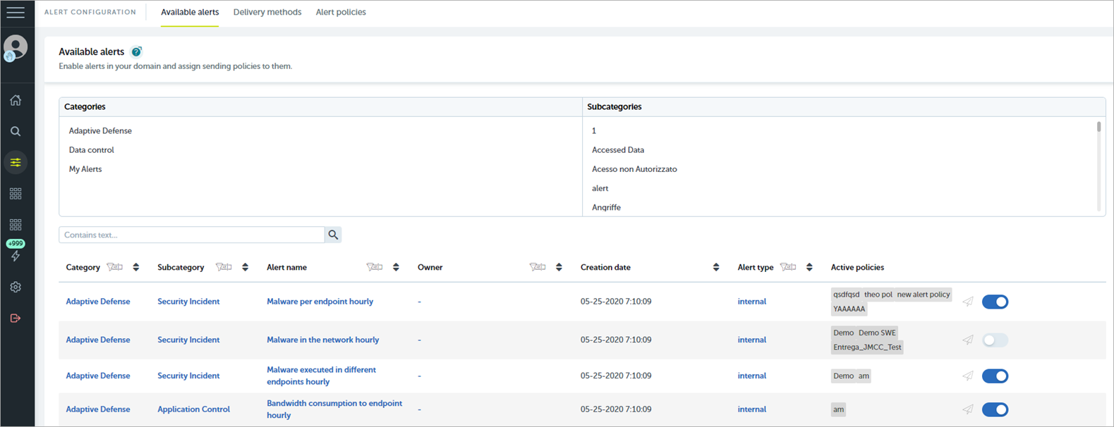
Available Alerts
On the Available Alerts tab, you can enable, disable, edit, and delete an alert. You can also assign a sending policy to the alert. For more information, go to Manage Available Alerts.
Delivery Methods
On the Delivery Methods tab, you specify how an alert is sent and to whom. For more information, go to Configure Delivery Methods for Alerts.
Alert Policies
On the Alert Policies tab, you define how the alerts generated are sent. This includes the delivery method and the anti-flooding policy. For more information, go to Create and Assign a Sending Policy for Alerts.
 Advanced Reporting
From the left pane, select Advanced Reporting ![]() and one of these dashboards:
and one of these dashboards:
- Security Incidents — Shows malware activity across the network and related information about malware execution in endpoints.
- Application Control — Shows detailed information about the installed applications that run on your user computers.
- Data Access Control — Shows information about data flows in your network so you can detect data leaks and theft.
Data Control
From the left pane, select Data Control ![]() and one of these dashboards:
and one of these dashboards:
- Files and Machines with PII — Shows the workstations and servers that contain PII files, the PII files found on the network, and the processes that performed operations on them.
- User Operations on PII Files — Shows the actions taken by users on PII files and the physical device where the personal data resided (for example, internal hard drive, USB drive).
- Risk of PII Extraction — Shows information about suspicious operations that could lead to a personal data breach.
- User Monitored Files — Shows information about the files that match the monitoring rules you define.
 Alerts
From the left pane, select ![]() . On the Alerts page, you can see current alerts and manage post filtering for alerts.
. On the Alerts page, you can see current alerts and manage post filtering for alerts.
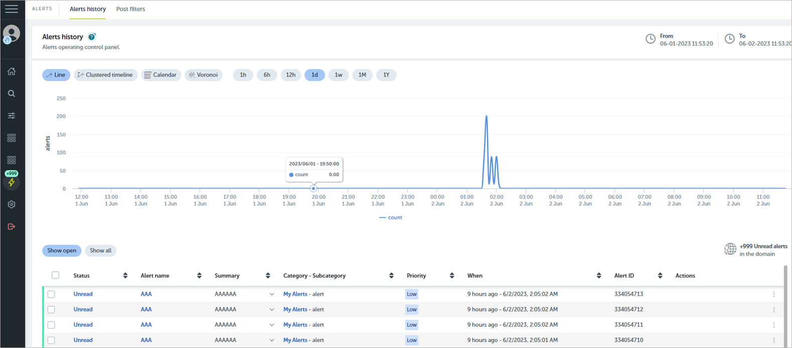
Alerts Dashboard
In the Alerts Dashboard tile, you can use a dynamic chart to analyze the overall quantity of alerts shown in the Alerts History area. The Alerts Overview includes a chart that represents the alerts triggered in the domain. You can change the type of chart to one of these options:
- Line chart
- Clustered timeline chart
- Calendar chart
- Voronoi chart
In the Alerts History section, you can review all alerts triggered in the network.
Post Filters
In the Post Filters tile, you can review the list of established filters, stop a filter temporarily, restart it, or permanently delete it. However, you cannot modify post filters. You must delete them first and then recreate them. For more information, go to Create Post Filters for Alerts.
Filter Alerts
On the Alerts Dashboard, you can use a variety of options to filter triggered alerts. The selections you make apply to both the Alerts History and Alerts Overview:
- To filter by time, click a time option above the chart (1h, 6h, 12h, 1d, 1w, 1m, 1y).
- To filter according to the alert status, click an option above the list (Show Open or Show All).
- To use a value as filtering criteria, click a value in one of the valid columns (Status, Alert name, Category - SubCategory, or Priority). To reset the filters applied, remove them individually or click Clear Filter above the list.
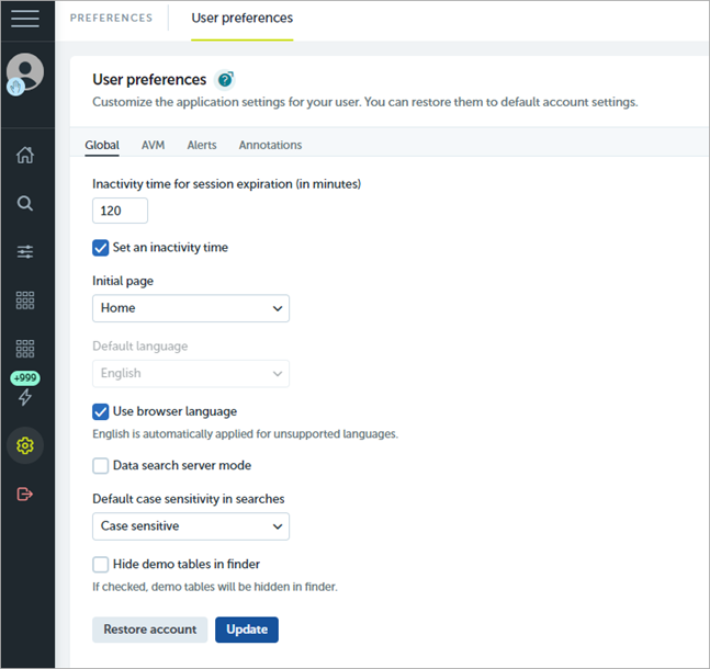
 Preferences
From the left pane, select Preferences ![]() to configure user preferences.
to configure user preferences.
 Log Out
From the left pane, select this icon to log out of the Advanced Reporting Tool.
About the Advanced Reporting Tool
About Data Control Advanced Visualization