AP — Baseline
Applies To: Wi-Fi Cloud-managed Access Points (AP120, AP125, AP225W, AP320, AP322, AP325, AP327X, AP420)
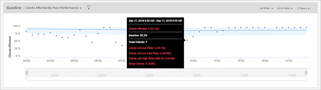
Baseline: Clients Affected By Poor Performance
This graph provides the baseline for the percentage of clients affected by poor performance for the selected AP over a period of time.
Hover over the data points to view details about the timestamp, clients affected, baseline, total clients, and clients with these issues:
- Low RSSI — The number of clients that are below the configured global RSSI threshold value.
- Low Data Rate — The number of clients that are below the configured global data rate threshold value.
- High Retry % — The number of clients that have a retry rate greater than 20%. The retry rate is the number of retry packets divided by the total number of data packets of a client.
- Sticky Clients — The number of sticky clients in the selected location. A sticky client is a device that stays associated with an AP, even when the signal strength is poor, instead of roaming to another AP that offers a stronger signal.
For information on how to set threshold values for low RSSI and data rates, see Set Global Data Rate and RSSI Thresholds.
You can select the SSID, frequency band, and time interval from the top-right corner of the widget.
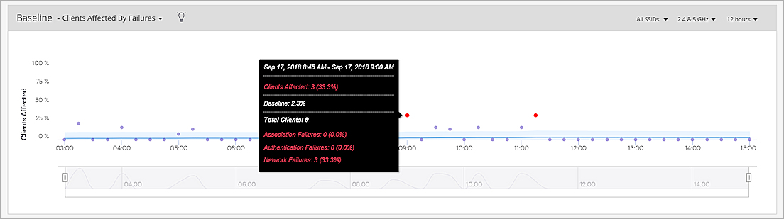
Baseline: Clients Affected by Failures
This chart provides a baseline for the percentage of clients that failed to associate because of connectivity issues.
Hover on a data point to see detailed information about the timestamp, clients affected, baseline, total clients, and client failures for authentication, association, and network issues.
You can select the SSID, frequency band, and time interval from the top-right corner of the widget.
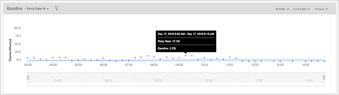
Baseline: Retry Rate%
This chart provides a baseline for the Retry Rate % of the clients connected to the selected AP. The retry rate of an AP is the aggregate value of the retry rate of all the clients connected to the AP.
Hover on a data point for detailed information on the timestamp, retry rate %, and baseline.
You can select the SSID, frequency band, and time interval from the top-right corner of the widget.
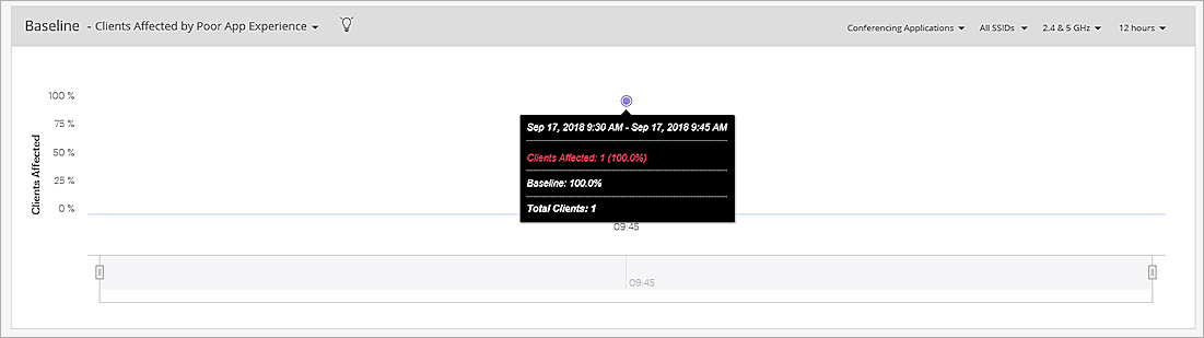
Baseline: Clients Affected by Poor App Experience
This chart provides a baseline for the percentage of clients affected by poor application experience for the selected AP. The graph can be viewed for all applications or specific conferencing applications such as Webex, Skype, GoToMeeting, Slack, and Hangouts.
Hover on a data point for detailed information about the timestamp, clients affected, baseline, and total clients.
You can select the conferencing application, SSID, frequency band, and time interval from the top-right corner of the widget.
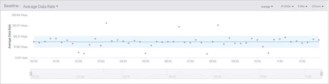
Baseline: Average Data Rate
This chart provides a baseline that shows the average data rates for the 2.4 GHz and 5 GHz frequency bands for the selected SSIDs and duration.
You can show the data rate for the Uplink, Downlink, or an Average of both rates.
You can select the SSID, frequency band, and time interval from the top-right corner of the widget.
For more information on how to read baseline charts in Discover, see Baseline Charts and Anomaly Detection.