Performance Dashboard
Applies To: Wi-Fi Cloud-managed Access Points (AP125, AP225W, AP325, AP327X, AP420)
To view the Performance Dashboard, select Dashboard, then select the Performance tab.
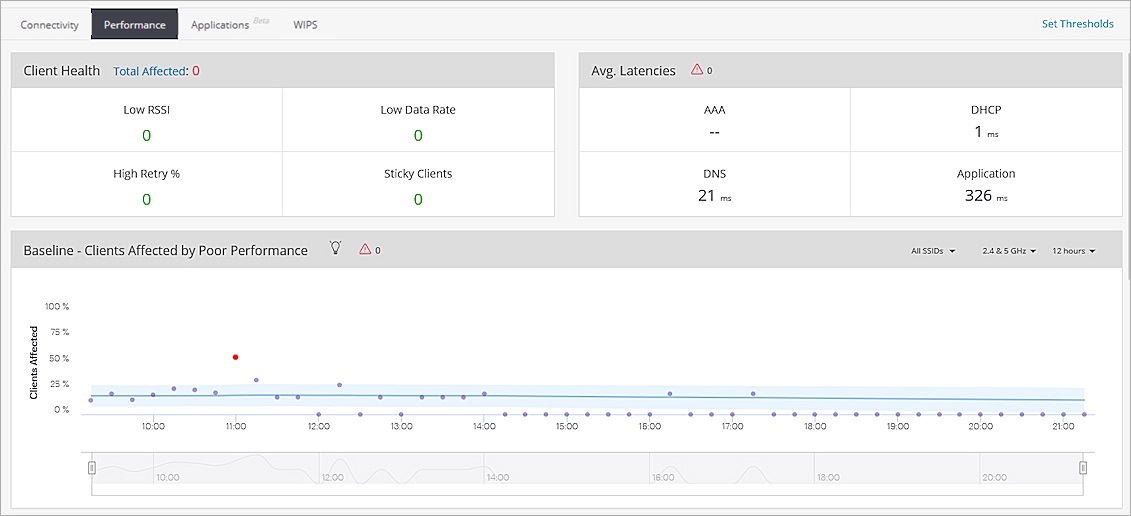
You can view the following information on the Performance Dashboard:
- Client Health — The total number of clients with Low RSSI, Low Data Rate, High Retry %, and Sticky Clients for the selected location. You can see the root cause analysis of the specific issue and any recommendations on how to resolve the issue.
- Average Latencies — The average latency time (response time) for servers such as DHCP, DNS, and AAA servers for the selected location.
- Baseline — Clients Affected by Poor Performance — The baseline for the percentage of clients affected by poor performance over a period of time.
- Clients By Average Data Rate — A bar graph that shows the average data rate of the clients for a selected location.
- Clients by RSSI — A bar graph showing the total number of clients and their RSSI values.
- Clients with Most Traffic — A horizontal bar graph of clients with the highest data usage.
- Top Locations Affected by Poor Performance — A horizontal bar graph of locations with the highest performance issues.
- Network Usage — A line graph showing the number of client associations and a bar graph that displays the traffic volume.
Client Health
The Client Health widget indicates clients that experience performance issues for the selected location:
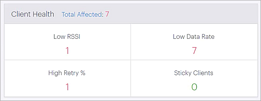
- Low RSSI — The number of clients that are below the configured global RSSI threshold value.
- Low Data Rate — The number of clients that are below the configured global data rate threshold value.
For information on how to set threshold values for low RSSI and data rates, see Set Global Data Rate and RSSI Thresholds.
- High Retry % — The number of clients that have a retry rate greater than 20%. The retry rate is the number of retry packets divided by the total number of data packets of a client.
- Sticky Clients — The number of sticky clients in the selected location. A sticky client is a device that stays associated with an AP, even when the signal strength is poor, instead of roaming to another AP that offers a stronger signal.
- Total Affected — The total number of clients in the selected location affected by all issues.
Click on the values for more information about the issue. For example, if you click on the Low RSSI value, you will be redirected to a page that lists all the clients with low RSSI values and their details. The clients can be active or inactive, and the data is updated every two minutes.
You can also see the root cause analysis of the issue and any recommendations on how to resolve the issue.
Average Latencies
The Average Latencies widget provides the average latency time (response time) for servers such as DHCP, DNS, AAA, and Application servers for clients in the selected location. This is the average time, in milliseconds (ms), taken by the individual servers to respond.
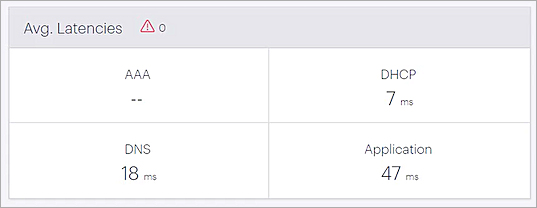
- AAA — Authentication, Authorization, and Accounting latency is determined by the time it takes for clients to receive a response from a RADIUS server.
- DHCP — DHCP latency is determined by the time it takes for clients to obtain an IP address from the DHCP server.
- DNS — DNS latency is determined by the time it takes for clients to obtain a DNS response from the DNS server.
- Application — Application latency is determined by the time it takes for clients to receive a response to a TCP segment.
When you click on a specific latency, you can view the selected service's average latency over a period of time.
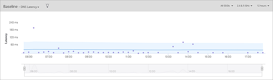
For more information on how to read baseline charts in Discover, see Baseline Charts and Anomaly Detection.
Clients By Average Data Rate
The Clients by Average Data Rate widget provides the average data rate utilized by all clients in the selected location. Click on a graph element to see detailed client data.
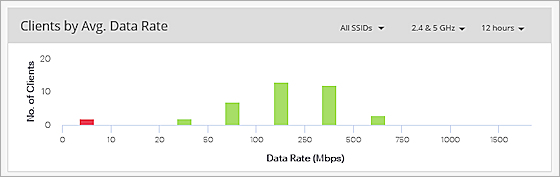
The classifications are:
- Red — Clients with a data rate below the configured threshold for low data rate.
- Green — Clients with a data rate above the configured threshold for low data rate.
- Yellow — Clients with a data rate within the data rate chart block where the threshold is set.
For information on how to set threshold values for low data rates, see Set Global Data Rate and RSSI Thresholds.
Clients by RSSI
The Clients by RSSI widget indicates the average RSSI (dBm) of the clients in the selected location. This is the measured signal strength of the client. Clients that access the wireless network can have varied RSSI levels. The widget calculates the average RSSI used by the total number of clients.
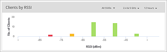
The classifications are:
- Red — Clients with an RSSI below the configured threshold.
- Green — Clients with an RSSI above the configured threshold.
- Yellow — Clients with an RSSI within the RSSI chart block where the threshold is set.
For information on how to set threshold values for low RSSI, see Set Global Data Rate and RSSI Thresholds.
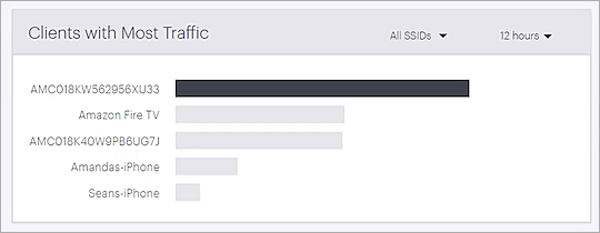
Clients with Most Traffic
The Clients with Most Traffic widget uses a bar chart to highlight clients with the highest data usage for the selected location.
The top five clients are listed. Hover over the client to view the total amount of data used by the client. Click on the name of the client to view detailed information about the client.
You can select the SSID and time interval from the drop-down list located on the top-right corner of the widget.
Network Usage
The Network Usage widget uses a line graph to shows the number of client associations and the traffic volume for all the clients in the selected location.
You can select the SSID, frequency band, and time interval from the top-right corner of the widget. The graph is updated every 15 minutes.
Hover over the graph to see the timestamp, number of clients associated, and the traffic volume.

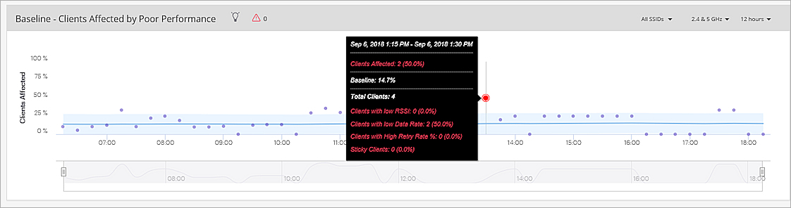
Baseline — Clients Affected by Poor Performance
The Baseline — Clients Affected By Poor Performance graph provides the baseline for the percentage of clients affected by poor performance over a period of time.
The poor performance is calculated based on these issues:
- Low RSSI — The number of clients that are below the configured global RSSI threshold value.
- Low Data Rate — The number of clients that are below the configured global data rate threshold value.
- High Retry % — The number of clients that have a retry rate greater than 20%. The retry rate is the number of retry packets divided by the total number of data packets of a client.
- Sticky Clients — The number of sticky clients in the selected location. A sticky client is a device that stays associated with an AP, even when the signal strength is poor, instead of roaming to another AP that offers a stronger signal.
Hover over the data points in the graph to view detailed information.
You can select the SSID, frequency band, and time interval from the top-right corner of the widget. The graph is updated every 15 minutes.
For more information on how to read baseline charts in Discover, see Baseline Charts and Anomaly Detection.
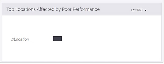
Top Locations Affected by Poor Performance
The Top Locations Affected by Poor Performance widget uses a horizontal bar graph to shows the top five locations and their clients that are affected by poor Wi-Fi network performance. The graph contains the data for the selected parent location and immediate child locations.
The poor performance is calculated based on these issues:
- Low RSSI — The number of clients that are below the configured global RSSI threshold value.
- Low Data Rate — The number of clients that are below the configured global data rate threshold value.
- High Retry % — The number of clients that have a retry rate greater than 20%. The retry rate is the number of retry packets divided by the total number of data packets of a client.
- Sticky Clients — The number of sticky clients in the selected location. A sticky client is a device that stays associated with an AP, even when the signal strength is poor, instead of roaming to another AP that offers a stronger signal.
You can select the type of issue from the drop-down list located at the top-right corner of the widget.
The top five locations with poor performance issues are listed.
- Hover over the graph bar in the chart to see the number of clients affected by poor performance compared to the total number of clients in that location.
- Click on a graph bar to list all clients that are affected by poor performance for the selected issue.