Applies To: WatchGuard Cloud
This feature is available only to participants in the WatchGuard Cloud Beta program.
The Application Risk dashboard acts as an encyclopedia of applications observed across WatchGuard-protected environments. It classifies applications by category, subcategory, delivery model, and exposure level.
To open the Application Risk dashboard, in WatchGuard Cloud:
- Select Dashboard > Application Risk.
The Application Risk dashboard opens.
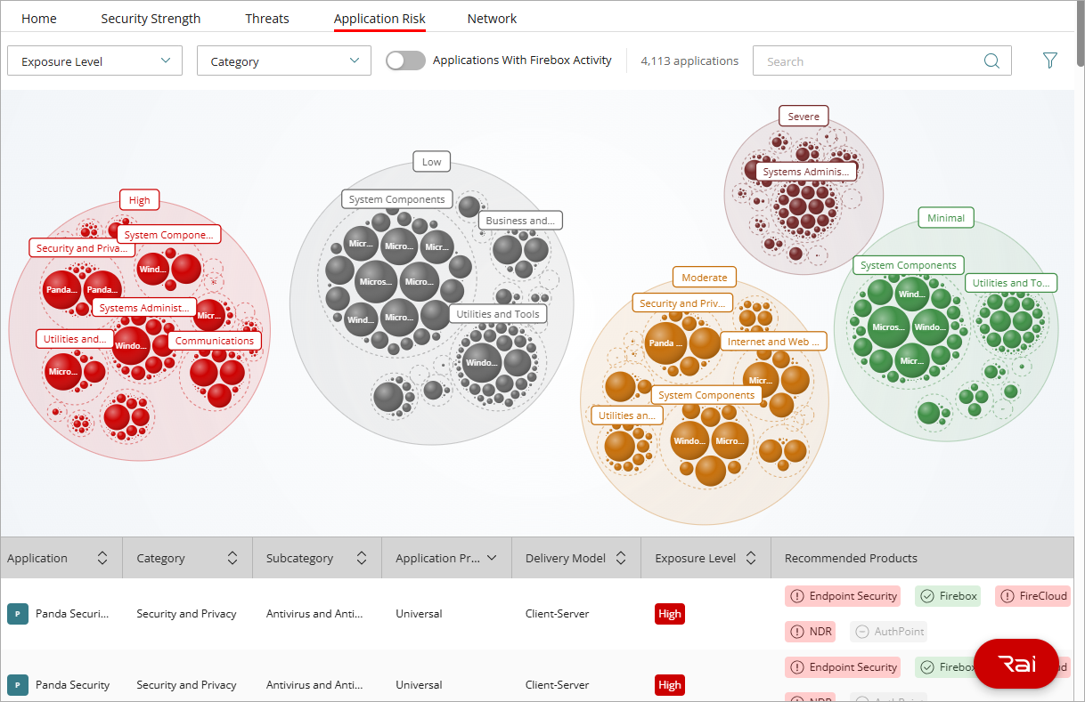
The Application Risk dashboard helps Service Providers and Subscribers understand the exposure level each application introduces and determine which WatchGuard products can help mitigate any risks. For more information about exposure level, go to Application Risk Dashboard — Exposure Level.
If Application Telemetry is enabled on the Firebox, then you can filter the dashboard to show only applications with Firebox activity. Your operator role must have the Devices permission. For more information, go to Enable Application Telemetry for Firebox Application Discovery.
The dashboard includes these areas:
- Bubble cluster chart — Visual overview of applications grouped by Category, Exposure Level, Publisher, or Subcategory
- Applications list — Sortable list of applications with recommended products
- Application details panel — Expanded information about a selected application
To appear in the dashboard, an application must be present in multiple customer environments. This internal threshold protects the privacy of account-specific application data.
Bubble Cluster Chart
The bubble cluster chart provides a high-level visualization of applications and their risks. The size of each bubble represents the prevalence of the application in the WatchGuard community. The color of the bubbles indicates the exposure level:
- Severe — Dark Red
- High — Bright Red
- Moderate — Yellow
- Minimal — Green
- Low — Gray
Application Grouping and Search
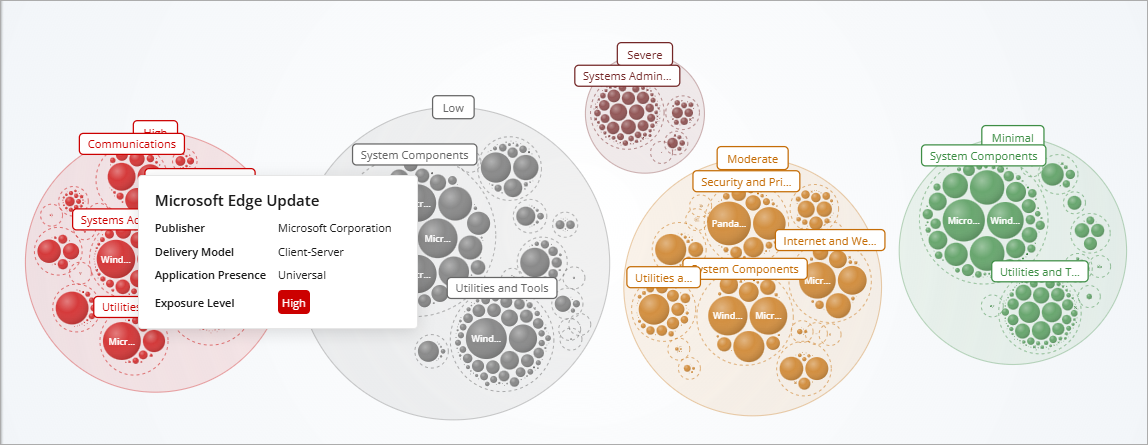
The bubble cluster chart includes grouping to enable you to organize and explore application data at multiple levels. For example, when the bubble chart is grouped by Category, the chart shows clusters where each cluster contains only applications that belong to the specific category. To remove grouping and return to the default chart, remove the selection from the Group By drop-down list.
By default, the dashboard opens grouped by Category and Exposure Level.
To group applications in the chart, from the Group By drop-down list, select how to group applications in the chart:
- Category
- Exposure Level
- Publisher
- Subcategory
The chart supports two-level grouping. To further subdivide the clusters, after you select an initial grouping, you can apply a second grouping, including Category, Publisher, or Subcategory.
You can drill down into a cluster. To show only the data within the selected cluster, select a cluster. You can continue to drill down to view individual subgroup data. To move back through grouping levels, from detailed charts to higher-level groupings, click the breadcrumb navigation trail.
To find a specific application, in the Search text box, enter an application name or publisher. You can filter the bubbles in the chart by:
- Category
- Exposure Level
- Delivery Model
- Recommended Products
Applications List
The Applications list shows the applications included in the bubble cluster chart.
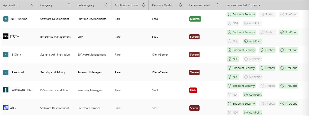
The list includes this information for each application:
- Application — The icon and name of the application.
- Category — The application category (for example, Business and Productivity, Communications, Cloud and Synchronization, and more).
- Subcategory — The subcategory within the application category (for example, Design and Creativity > Graphic Design).
- Application Presence — The prevalence of the application (Universal, Widespread, Common, Occasional, or Rare). Presence is calculated based on the number of endpoints where the application has been executed, relative to the total number of unique endpoints with observed application activity.
- Delivery Model — How the application is deployed (Local, Client-Server, or SaaS).
- Exposure Level — The risk level associated with the application. For more information, go to Application Risk Dashboard — Exposure Level.
- Recommended Products — WatchGuard products that help mitigate risk for the application. Green indicates that the product is recommended and it is allocated in the account. Red indicates that the product is recommended but there is no product license. Gray indicates that the product is not necessary to mitigate the risks introduced by the application.
Your operator role determines what you can see and do in WatchGuard Cloud. Information in the application list is restricted to the accounts and products available to your operator account. For more information, go to Manage WatchGuard Cloud Operators and Roles.
Application Details Panel
When you select an application in the bubble cluster chart or from the list, the Application Details panel opens.
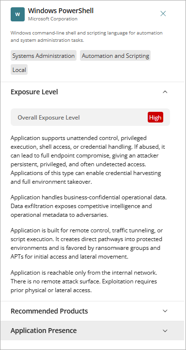
This panel provides additional information about a selected application, including:
- Application description and categories. When Application Telemetry is enabled for the Fireboxes in the account, AI shows for applications that use artificial intelligence (AI). For more information, go to Enable Application Telemetry for Firebox Application Discovery.
- Overall exposure level and description. For more information, go to Application Risk Dashboard — Exposure Level.
- A list of recommended WatchGuard products to minimize risk.
- Application presence in the WatchGuard community by the number of endpoints and accounts (Rare, Occasional, Common, Widespread, or Universal).
- Network activity in the account. This section shows only when you enable Applications With Firebox Activity and there are Fireboxes in the account with application telemetry enabled. It shows Firebox activity in the last 30 days, including bandwidth usage, the number of connections, and the number of Firebox users and IP addresses. Data updates every 24 hours.