Applications Dashboard
Applies To: Wi-Fi Cloud-managed Access Points (AP120, AP125, AP225W, AP320, AP322, AP325, AP327X, AP420)
The Application Dashboard contains these widgets:
- Application Experience — Displays data representing the overall client experience for each application, such as the number of good and poor client experiences for each application.
- Baseline — Clients Affected — Displays baseline activity that shows when clients are affected by poor application experience.
- Baseline — % Poor Application Experience — Displays baseline activity to indicate periods of poor application experience.
- Top Applications By Traffic — Displays a bar graph of the top five applications that have the highest data usage.
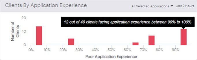
- Clients by Application Experience — Displays the client distribution for aggregated application experience or the experience for each application.
Application Experience
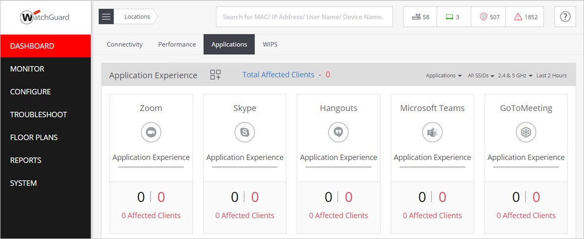
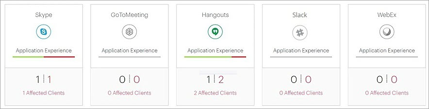
The Application Experience widget lists several popular conferencing and web-based applications. The widget provides a count of good or poor client experiences, and a graph bar that indicates good or poor application experience in the last two hours for each application.
You can track up to 10 applications. You can pin a maximum of 5 out of the 10 applications on the widget. Click ![]() to select which applications to add or remove from the display.
to select which applications to add or remove from the display.
- Conferencing applications — Monitor popular conferencing applications such as Zoom, Skype, Hangouts, Microsoft Teams, GoToMeeting, Slack, and WebEx.
- Web-based enterprise applications — Monitor web-based enterprise applications such as email, human resources and project management applications, Intranet, Online Drives, and many other applications.
- Custom applications — Click Custom Applications to define your own custom applications to monitor. You can define the application name, hostname/IP address, and the port number to monitor.
Web applications that use UDP are not supported. Application monitoring for quality experience inspects the IP and TCP headers only. No user data is inspected.
To see all monitored applications, click Show All. If you do not pin any applications, you can show the Most Affected or Most Used applications.
The Total Affected Clients value indicates the number of clients affected by poor application experience for all monitored applications.
The graph bar for each application uses red and green colors to indicate the status of client application experience. Red indicates clients affected by poor application experience, and green indicates the total unaffected clients. Hover on the graph bar to view a percentage count of clients with a poor application experience.
Below the graph bar, the number in black indicates the total number of clients using the application. The number in red indicates the total number of clients affected by poor application experience. Click the number to view detailed information on clients.
Click each application icon to view details specific to the application.
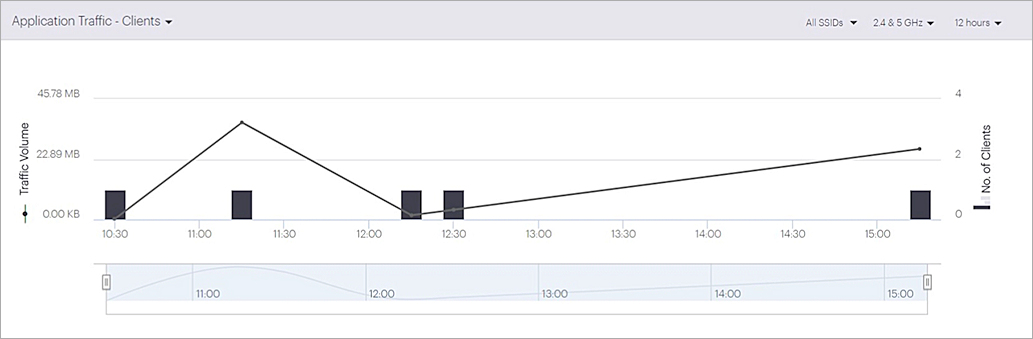
The Application Traffic widget indicates the traffic volume for the selected application over a period of time at the selected location.
You can select the SSID, frequency band, and time interval from the top-right corner of the widget.
Click Start Live to view live data for the application. A line graph appears that displays traffic volume of the application over time. Click Stop Live when finished.

The Application Traffic — Clients widget shows the time periods for which application quality was good or poor for clients using the application at the selected location.
You can select the SSID, frequency band, and time interval from the top-right corner of the widget.
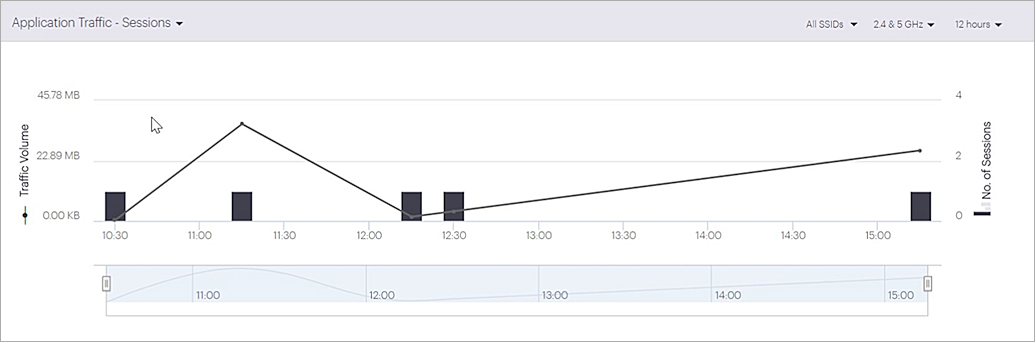
The Application Traffic — Sessions widget graphically indicates session analytics based on the number of good or poor sessions over a period of time. The data is displayed for clients using the application at the selected location. The graph is updated every 15 minutes.
Hover the mouse over the graph to see the timestamp, traffic volume, and number of sessions during the time period.
You can select the SSID, frequency band, and time interval from the top-right corner of the widget.
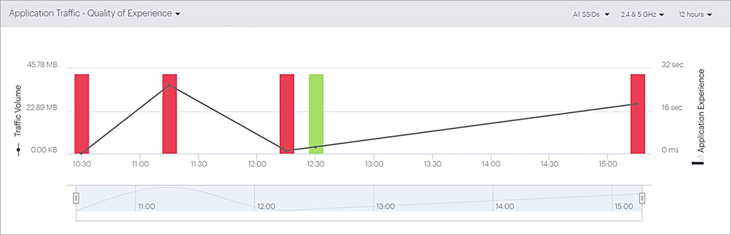
The Application Traffic — Quality of Experience widget shows the overall client experience for the application in the selected location. In the graph bar, red indicates a poor application experience, and green indicates a good application experience.
You can select the SSID, frequency band, and time interval from the top-right corner of the widget.
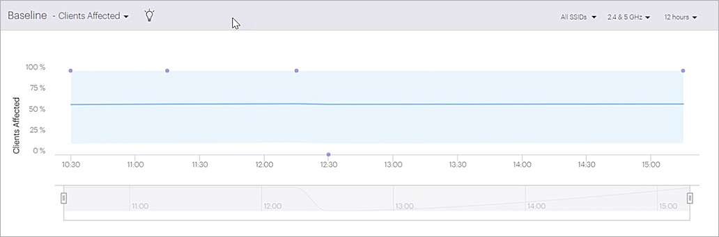
The Baseline — % Clients Affected by Poor App Experience widget provides a baseline for the percentage of clients affected by poor application experience. This image shows the baseline graph for clients affected by poor application experience. Hover on the data points to retrieve detailed information about clients that experienced poor application experience during the selected time interval.
You can select the SSID, frequency band, and time interval from the top-right corner of the widget.
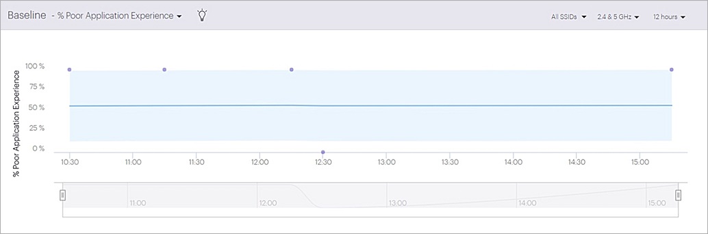
The Baseline — % Poor App Experience widget provides a baseline for the percentage of poor application experience over a time period. Hover on the data points to show detailed information about periods of poor application experience.
You can select the SSID, frequency band, and time interval from the top-right corner of the widget.
The Clients with Most Application Traffic widget provides a list of clients with the highest usage of the selected application along with detailed information about the clients. The value in the top-left corner indicates the total number of clients with the most traffic.
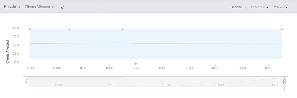
Baseline — Clients Affected
The Baseline — Client Affected chart calculates a baseline for the percentage of clients affected by poor application experience.
Hover on the individual data points to view data about clients that experienced application issues for the selected time interval.
You can select the SSID, frequency band, and time interval from the top-right corner of the widget.
For more information on how to read baseline charts in Discover, see Baseline Charts and Anomaly Detection.
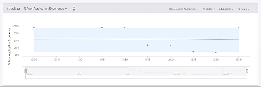
Baseline — % Poor Application Experience
The Baseline — % Poor App Experience chart calculates a baseline for the percentage of time for poor application experience.
Click the individual data points in the graph to view the filtered baseline charts.
You can select the specific conferencing applications, the SSID, frequency band, and time interval from the top-right corner of the widget.
For more information on how to read baseline charts in Discover, see Baseline Charts and Anomaly Detection.
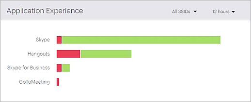
Application Experience
The Application Experience chart provides information on the overall client experience for each application. Red indicates a poor application experience, and green indicates a good application experience.
Hover on a graph bar to view details of the conferencing application:
- Total traffic
- Total experience time
- Percentage of time for poor application experience by a client
You can select the SSID and time interval from the top-right corner of the widget.
Top Applications By Traffic
The Top Application By Traffic chart shows the top five applications in use by clients on your Wi-Fi network.
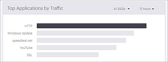
- Hover over a graph bar to see the amount of traffic for each application.
- Click on an application graph bar to see details about application usage including a live application traffic chart and the list of top clients using the application.
- You can select the SSID and time interval to view from the top-right corner of the widget.
Clients by Application Experience
The Clients by Application Experience widget shows the total number of clients with poor application experience for the selected applications and time period.